Inkontext
Brand · Website · Film — one cohesive experience
INKONTEXT came to me in the middle of an exciting shift. What started as a one-woman practice had grown into an international team with a bold vision for architecture.
Their work had evolved — but their digital presence hadn’t caught up yet.
In a market often driven by rigid processes and transactional services, the studio wanted to stand out for something else:
thoughtful collaboration,
creative courage,
and a deeper connection between people and the spaces they inhabit.
Their goal was simple but powerful:
create a presence that clearly communicates their mindset — so the right clients and collaborators recognize them instantly.
With only the name and logo set in stone, we rolled up our sleeves.
While their new image film was being produced, we shaped a digital experience around it — bringing together storytelling, design and cinematography into one cohesive world.

The result is a minimal, elegant website that lets their talent, unique character and scenic image film breathe.
The design stays calm and intentional — supporting the experience without trying to steal the spotlight.
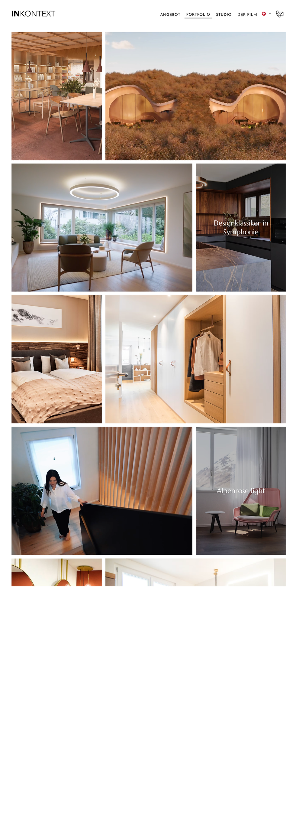

The new website became more than a portfolio.
It became a digital expression of the studio itself — human, visionary and confident in its craft.
By translating their philosophy into a clear and compelling online presence, the studio can now communicate the depth of their work within seconds. Potential clients immediately understand not only what they do, but how they think.


The result is a stronger positioning in the market, more aligned inquiries, and conversations that begin with trust already in place.
The website now attracts the kind of projects the studio truly wants to create — thoughtful, ambitious spaces shaped through genuine collaboration.
Today, the platform helps them attract more aligned projects, build trust faster with potential clients, and confidently present the depth of their work.
Refining the visual language of the studio while keeping the existing name and logo intact. This included developing a more cohesive brand atmosphere through updated colors, typography, graphic elements, and overall aesthetic direction.
Creating a consistent design system that expresses the studio’s elegance, clarity, and visionary mindset — including typographic hierarchy, color palette, shapes, layout rhythm, and visual tone.
Defining how the studio’s philosophy, projects, and team would be presented online so visitors quickly understand both the mindset and the value behind their work.
A minimal, elegant website that lets their architecture and cinematography breathe. The design stays calm and intentional — supporting the experience without trying to steal the spotlight.
While the studio’s image film was being produced, we aligned the digital experience with the visual storytelling. Different creatives, one shared vision — making sure everything feels like it belongs to the same world.